
 Autora: Lorena Múnera
Autora: Lorena Múnera
Autora: Lorena Múnera
In the world of data analytics, the ability to interpret and communicate information effectively is supremely important. Therefore, data visualization is an indispensable resource that provides end users with a powerful tool to understand and extract valuable insights from complex datasets. In this article, we will explore a fundamental aspect of data visualization: types of charts. Recognizing which type of chart is most suitable for each need and type of data is essential, hence, we will explore the main types of charts used for data visualization, seeing how they can be effectively used to represent a variety of data.
First but not least, what are charts?
Charts are the different ways of representing series of statistical data of various types and origins to visually demonstrate how one or more variables evolve in comparison with others, allowing for the accessible representation of complex information.

Next, we will explore the main types of charts:
Bar chart:
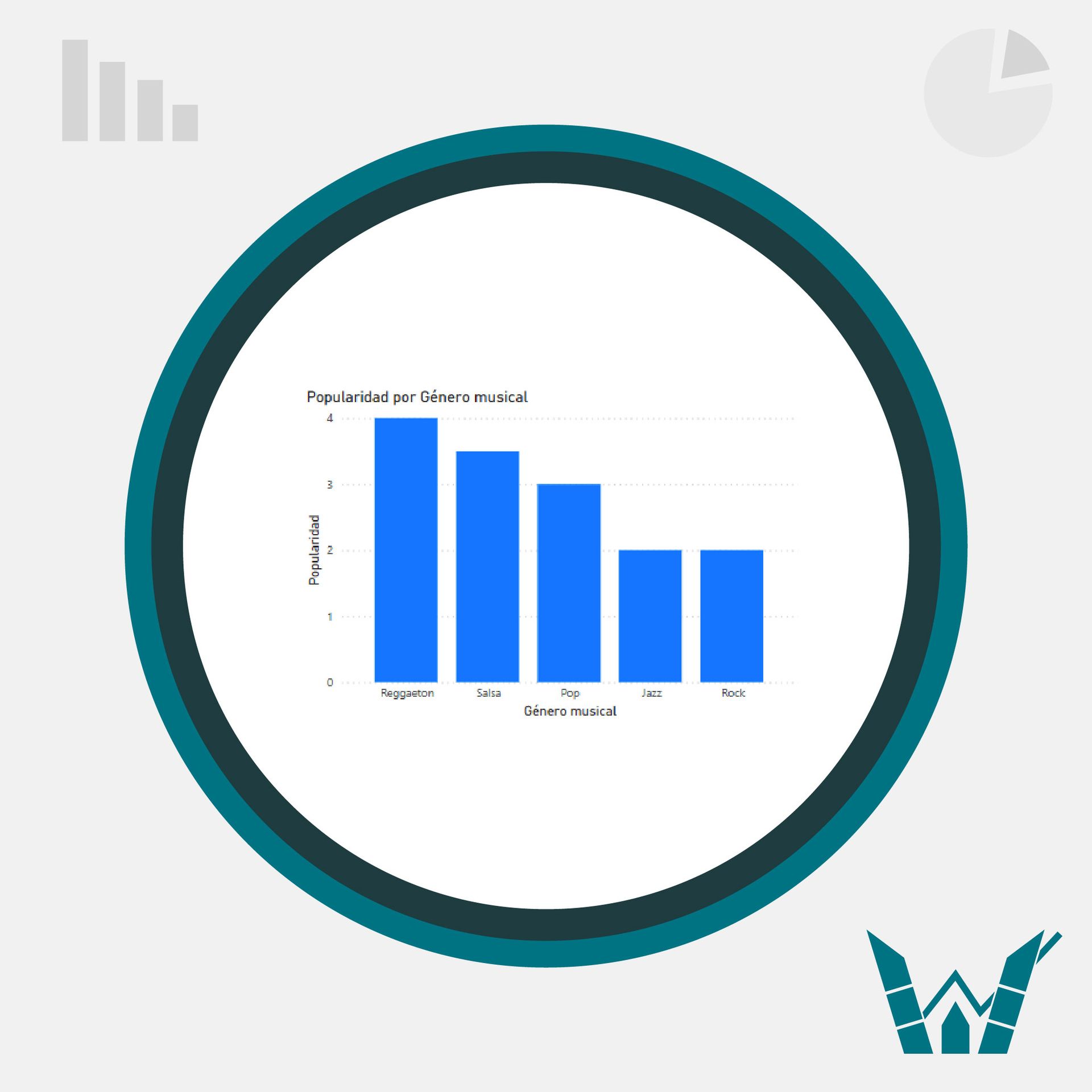
They are useful for comparing discrete data, showing trends over time, and plotting multiple data series.
For example, if we want to compare the popularity of different music genres among young people in the city, this information can be represented with a bar chart where each bar represents a specific music genre, and the height of the bar represents the relative popularity of that genre among the surveyed youth, determined by a rating on a scale from 1 to 5.
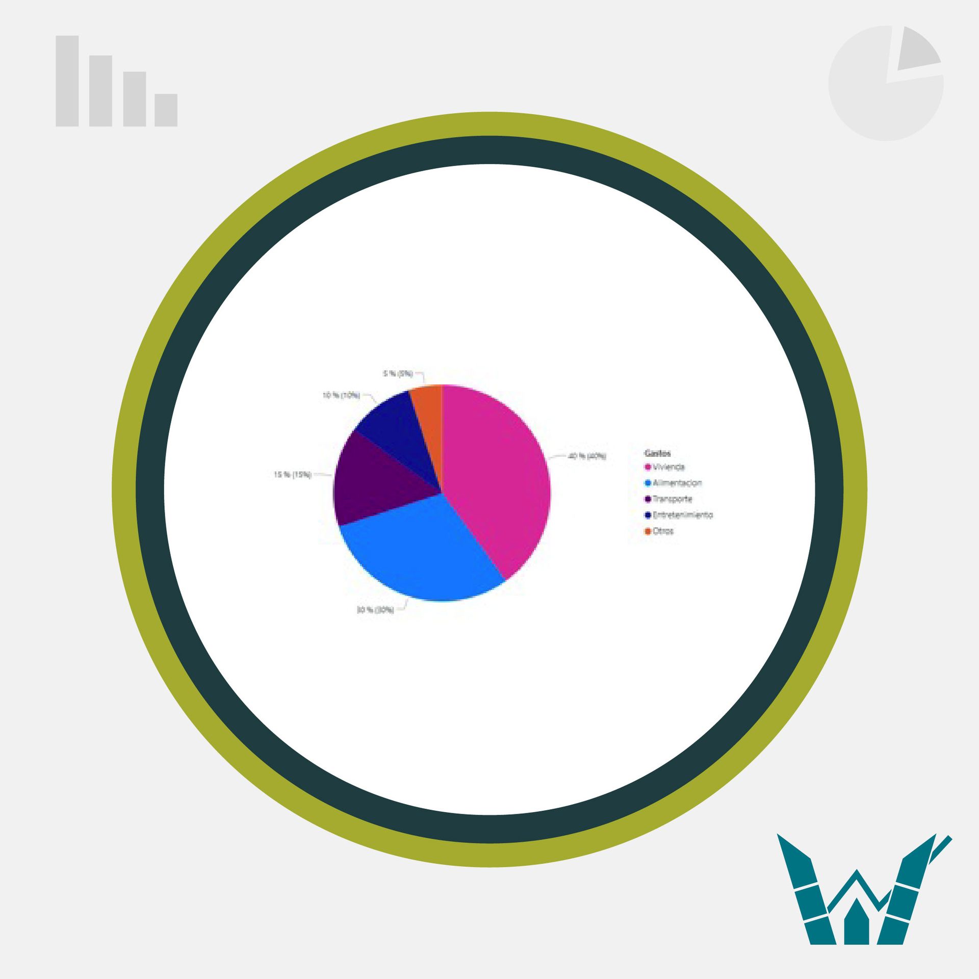
Pie chart:
They are useful for highlighting proportions. They use circular segments to show the relationship of the parts to the whole.
NOTE: Care should be taken with this type of chart as it can be confusing to differentiate between two parts of the whole that have similar values.
Line chart:
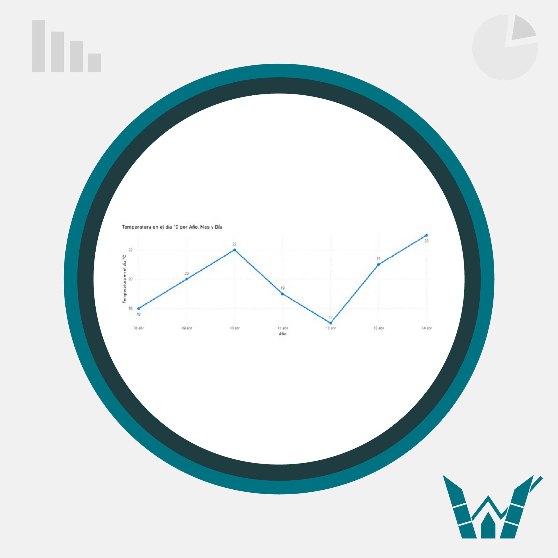
They are useful for showing trends over time and for comparing many data series. Line charts plot data at regular intervals connected with lines.
For example, let's say we are analyzing the evolution of daily temperatures during a week in a specific city. We could represent this information using a line chart, where the horizontal axis represents the days of the week and the vertical axis represents temperatures in Celsius degrees. Each point on the line represents the temperature recorded for a specific day, and by plotting a line through these points, we can visualize how temperatures change throughout the week. This would help us identify weather patterns, such as temperature fluctuations or warming/cooling trends during the analyzed period.
Scatter plot:
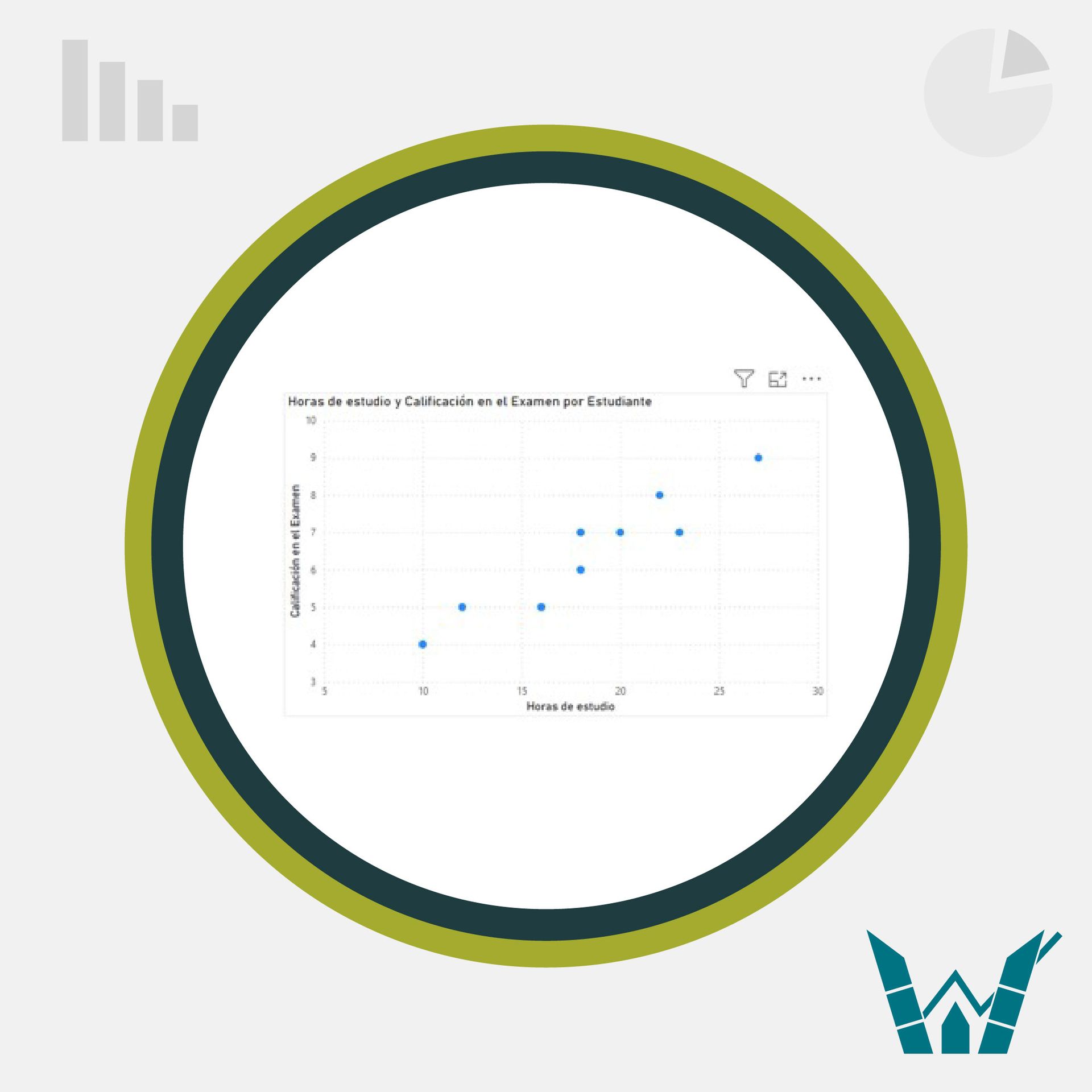
They use data points to plot two measures anywhere on a scale, not just with regular scale markings.
For example, let's imagine we are studying the relationship between the number of study hours and the grades obtained in an exam for a group of students. We could represent this information using a scatter plot, where each point on the plot represents a student. On the horizontal axis, we represent the study hours, and on the vertical axis, we represent the grades obtained in the exam. Each point on the plot represents a pair of values: the study hours of a student and their grade on the exam. By observing the general pattern of dispersion of points on the plot, we can determine if there is any relationship between the number of study hours and the grades obtained. This would help us better understand the influence of study time on academic performance.
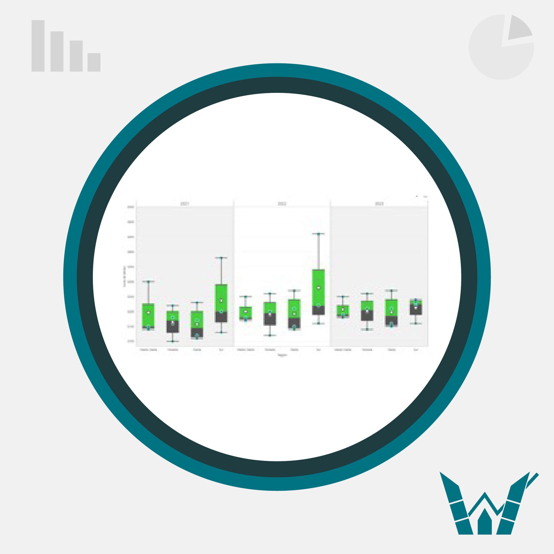
Box and whisker plot:
A box and whisker plot shows the distribution of data in quartiles, highlighting the average and outliers. The boxes may have lines extending vertically called "whiskers". These lines indicate variability outside the upper and lower quartiles, and any point outside these lines or whiskers is considered an outlier.
For example, let's imagine a retail company operating in various geographic regions needs to analyze the sales of its products in each of them. The vertical axis of the plot will represent sales, while the horizontal axis will show the regions.
Each region will have its own box with upper and lower limits, indicating the interquartile range, and the whiskers will show the minimum and maximum values. This will allow for quickly identifying regions with higher and lower sales, as well as those with greater variability in their results.
Histogram:
A histogram is similar in appearance to a bar chart, but instead of comparing categories or looking for trends over time, each bar represents how data is distributed in a single category. Each bar represents a continuous range of data or the number of frequencies of a specific data point.
Histograms are useful for showing the distribution of a single scale variable. Data is grouped and summarized using a percentage or count statistic.
For example, if we want to know the age variation among members of a symphonic band, where on the x-axis we have age ranges and on the y-axis we have the frequency of these data, i.e., the number of people of a specific age.

In summary, charts are fundamental tools in data analysis as they allow for clear and concise visualization of complex information. Each type of chart has its specific utility, from comparing discrete data to showing trends over time or highlighting proportions.
Bar charts are ideal for comparing data and showing trends over time, while pie charts are effective for highlighting proportions. On the other hand, line charts are excellent for visualizing temporal trends, and scatter plots are useful for identifying relationships between two variables.
By understanding which type of chart to use in each situation, data analysts can effectively communicate their findings and facilitate informed decision-making. Finally, mastering the use of these charts is essential to fully harness the potential of data and gain valuable insights for any organization.